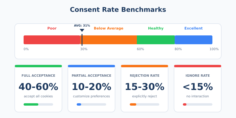
Your cookie consent banner is probably costing you data. The average acceptance rate sits at just 31% — meaning nearly 70% of your visitors either reject tracking or ignore the banner entirely. For analytics, that’s a massive blind spot.
But here’s what most businesses get wrong: they treat consent as a legal checkbox rather than a user experience challenge. The result? Banners that frustrate visitors, trigger instant rejections, and leave you with incomplete data.
This guide shows you how to design consent banners that respect privacy regulations, provide genuine user choice, and still maintain healthy consent rates. No dark patterns. No manipulation. Just smart design that works for everyone.
Why Your Consent Rate Matters More Than You Think
Every visitor who rejects cookies or closes your banner without responding becomes invisible to your analytics. You can’t track their journey, measure their engagement, or understand what brought them to your site. In practice, low consent rates mean:
- Gaps in your data — 40-70% fewer tracking data points with real reject options
- Skewed analytics — The visitors you can track aren’t representative of all visitors
- Broken attribution — You can’t see which channels actually drive conversions
- Wasted ad spend — Retargeting and lookalike audiences become unreliable
A healthy consent rate benchmark is 60-80%. If you’re significantly below that, your banner design likely needs work. However, chasing higher numbers through manipulation backfires — both legally and practically.
The Compliance Foundation: What the Law Actually Requires
Before optimizing for conversions, you need to understand the legal baseline. Under GDPR and similar regulations, valid consent must be:
| Requirement | What It Means | Common Violations |
|---|---|---|
| Freely given | Users can refuse without penalty | Blocking content until acceptance |
| Specific | Separate consent for different purposes | Bundling analytics with marketing |
| Informed | Users understand what they’re agreeing to | Legal jargon, hidden details |
| Unambiguous | Clear affirmative action required | Pre-ticked boxes, implied consent |
Additionally, regulators now specifically target design choices that bias users toward acceptance. In 2025, Austria’s high court ruled that colored “Accept” buttons paired with gray “Reject” links violate GDPR’s requirement for equal prominence. This reflects a broader trend — what worked in 2020 may now be explicitly illegal.
For a deeper understanding of these regulations and how they affect your analytics, see our guide on the global privacy landscape for analytics.
Cookie Banner Design Principles That Actually Work
Good cookie banner design balances three competing goals: legal compliance, user experience, and data collection. Here’s how to achieve all three.
Principle 1: Visual Parity Between Options
Your “Accept” and “Reject” buttons must look equally prominent. Same size. Same visual weight. Same ease of access. This isn’t just ethics — it’s now a legal requirement in many jurisdictions.
What visual parity looks like:
- Both buttons same size and shape
- Similar color contrast against the background
- Equal positioning (neither hidden nor de-emphasized)
- Same number of clicks required for either choice
What violates parity:
- Bright “Accept” button with a gray text link for “Reject”
- “Accept” as a button, “Reject” hidden in settings
- Requiring multiple clicks to reject but one click to accept
In my experience, businesses fear that equal prominence will tank their consent rates. The data tells a different story. Banners with clear parity often achieve 55-65% acceptance — lower than manipulative designs, but the consent is actually valid and the data is legally usable.
Principle 2: Clarity Over Cleverness
Users make consent decisions within 8 seconds. Long explanations, legal terminology, and complex category breakdowns just create friction. Instead:
- Lead with the point — “We use cookies for analytics and personalization”
- Use plain language — Replace “legitimate interest processing” with “improving our site”
- Keep it short — 2-3 sentences maximum for the main banner
- Offer details separately — Link to full explanation for those who want it
Good example: “We use cookies to understand how you use our site and improve your experience. You can accept all cookies or customize your preferences.”
Bad example: “This website uses cookies and similar technologies to collect information about your browsing activities which we use to analyse your use of the website, to personalise our services and to customise our online advertisements pursuant to our legitimate interests…”
Principle 3: Respect the User’s Time
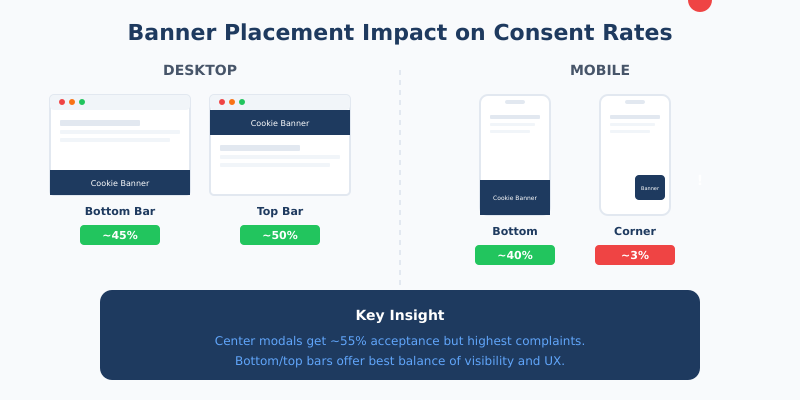
Banner placement and timing significantly impact both consent rates and user experience. Research shows:
| Placement | Desktop Acceptance | Mobile Acceptance | Notes |
|---|---|---|---|
| Bottom bar | ~45% | ~40% | Less intrusive, good baseline |
| Top bar | ~50% | ~45% | Higher visibility, some interference |
| Center modal | ~55% | ~50% | Highest engagement but most intrusive |
| Bottom-right corner | ~34% | ~3% | Easily missed on mobile |
Center modals get the highest engagement but also the most complaints. For most sites, a bottom or top bar provides the best balance. Whatever you choose, ensure the banner doesn’t cause layout shift — Google penalizes sites where banners push content around after the page loads.
Principle 4: Make Preferences Genuinely Accessible
Granular controls aren’t just a compliance requirement — they build trust. Users who feel in control are more likely to accept at least some tracking. Offer clear categories:
- Necessary — Always on, required for basic functionality
- Analytics — Understanding how the site is used
- Marketing — Personalized advertising
- Preferences — Remembering user settings
Many users will accept analytics while rejecting marketing cookies. This partial consent is valuable — you still get behavioral data for site improvement, just without cross-site tracking.
Dark Patterns to Avoid (They’ll Cost You Eventually)
Dark patterns are design choices that manipulate users into unintended actions. In the consent context, they might boost short-term acceptance rates, but they create real risks:
- Legal liability — Regulators actively hunt for these patterns now
- Invalid consent — Data collected through manipulation may be legally unusable
- Brand damage — Users notice and remember feeling tricked
- Retroactive problems — You may need to delete data collected improperly
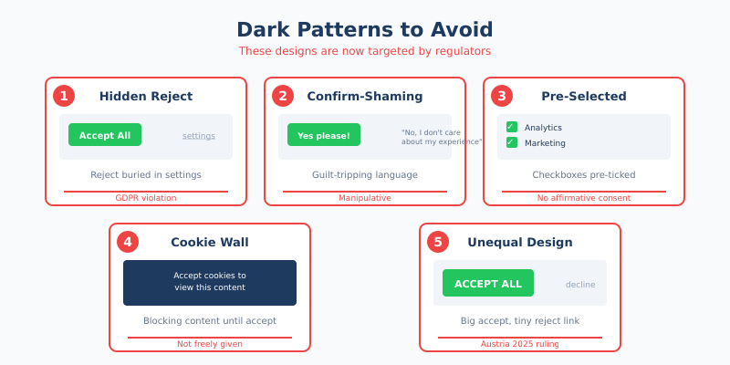
Patterns now specifically targeted by regulators include:
| Dark Pattern | What It Looks Like | Why It Fails |
|---|---|---|
| Hidden reject | Reject option buried in settings | GDPR requires equal access |
| Confirm-shaming | “No, I don’t care about my experience” | Manipulates through guilt |
| Pre-selected options | Marketing cookies checked by default | Violates affirmative consent rule |
| Cookie walls | Blocking content until acceptance | Consent isn’t freely given |
| Nagging | Repeated prompts after rejection | Pressures users into acceptance |
The irony is that dark patterns often don’t even work long-term. Users who feel manipulated are more likely to use ad blockers, reject everything by default, or simply leave your site.
Technical Considerations That Affect UX and Compliance
Your banner’s technical implementation matters as much as its design. Poor implementation creates compliance gaps and damages user experience.
Load Before Track
No tracking should fire before consent is given. This seems obvious, but many implementations get it wrong. The sequence must be:
- Page loads with essential cookies only
- Banner appears
- User makes choice
- If accepted, tracking scripts load
- Consent is stored for future visits
If your analytics start collecting data before the banner even appears, you’re in violation — regardless of what happens next.
Performance Impact
Cookie banners can significantly impact Core Web Vitals, which affects both user experience and search rankings. Key metrics to watch:
- Cumulative Layout Shift (CLS) — Keep below 0.10; banners that push content fail this
- Largest Contentful Paint (LCP) — Banner shouldn’t add more than 200ms
- First Input Delay (FID) — Banner JavaScript shouldn’t block user interaction
For insights on how page performance affects your broader analytics, see our article on website speed and measurement.
Accessibility Requirements
Since June 2025, the European Accessibility Act makes WCAG 2.2 compliance mandatory. Your consent banner must:
- Work with keyboard navigation (no mouse required)
- Be compatible with screen readers
- Have minimum 4.5:1 color contrast
- Include visible focus indicators
- Not rely solely on color to convey information
Accessibility isn’t just a legal requirement — it’s good UX that benefits all users.
Measuring and Improving Your Consent Rate
You can’t improve what you don’t measure. Track these consent banner UX metrics:
| Metric | What to Track | Healthy Range |
|---|---|---|
| Overall consent rate | % who click Accept (any level) | 60-80% |
| Full acceptance rate | % who accept all categories | 40-60% |
| Partial acceptance rate | % who customize and accept some | 10-20% |
| Rejection rate | % who explicitly reject | 15-30% |
| Ignore rate | % who don’t interact at all | <15% |
| Time to decision | Seconds from banner display to choice | <8 seconds |
High ignore rates often indicate banner fatigue or poor placement. High rejection rates might signal trust issues or overly aggressive cookie requests. Analyze by segment — mobile users often behave differently than desktop users.
A/B Testing Your Banner (Ethically)
Testing different banner designs is legitimate, but stay within ethical bounds:
Acceptable to test:
- Banner placement (top vs. bottom)
- Copy variations (different wording, same meaning)
- Color schemes (maintaining parity)
- Category groupings and labels
Not acceptable to test:
- Removing or hiding the reject option
- Different prominence levels for accept vs. reject
- More friction for rejection than acceptance
When testing, track both consent rates and subsequent user behavior. A design that gets higher acceptance but increases bounce rate isn’t actually winning.
Banner Copy That Builds Trust
The words on your banner matter. Here’s a framework for writing GDPR cookie consent copy that’s both compliant and effective:
The Opening Line
Lead with what you’re asking for and why. Skip the “We value your privacy” — users have seen it thousands of times and it means nothing.
Instead of: “We value your privacy. This website uses cookies…”
Try: “We use cookies to understand how you use our site and improve your experience.”
The Value Proposition
Briefly explain what users get from accepting. Be specific and honest:
- “Analytics help us fix problems and improve content”
- “Preferences remember your settings between visits”
- “Marketing cookies help us show relevant offers”
The Options
Label buttons clearly and neutrally:
- Good: “Accept All” / “Reject All” / “Customize”
- Also good: “Allow Cookies” / “Decline” / “Manage Preferences”
- Bad: “Accept” / “Learn More” (where Learn More is the reject path)
- Bad: “Yes, optimize my experience!” / “No thanks”
What Happens After Rejection
When users reject cookies, you’re not completely blind. You can still collect:
- Aggregated server-side data — Page requests, basic traffic patterns
- Essential session data — Cart contents, login status
- Contextual information — What pages were viewed (without tracking across sessions)
This connects directly to first-party data strategies — building analytics that work even without traditional tracking. Users who reject cookies aren’t necessarily lost; they’re just measured differently.
Additionally, consider the users who reject everything but keep visiting. They might become your most valuable customers — privacy-conscious people tend to be intentional about where they spend money. Don’t write them off just because you can’t track them.
Mobile-Specific Considerations
Mobile consent rates typically run 5-10% lower than desktop. The reasons are straightforward:
- Smaller screens make banners more intrusive
- Fat-finger errors are common (users accidentally dismiss)
- Users are often in a hurry, less patient with interruptions
- Some banner designs that work on desktop fail completely on mobile
Mobile optimization tips:
- Bottom placement — Easier to reach than top on most phones
- Large touch targets — Buttons at least 44×44 pixels
- Simplified options — Consider fewer categories on mobile
- Test on actual devices — Emulators miss real-world issues
The 3.4% acceptance rate for bottom-right corner banners on mobile (vs. 34% on desktop) illustrates how dramatically design choices play out differently across devices.
Continue Learning
Explore more about privacy-respecting analytics and user experience:
- The Hidden Cost of Spam Traffic — Even with consent, bot traffic skews your data
- Tracking Unique Visitors — Understand your real audience despite consent limitations
- Beyond Pageviews: Advanced Metrics — Focus on what you can measure accurately
Bottom Line
A good cookie consent banner isn’t about maximizing acceptance at any cost. It’s about earning genuine consent through clear communication and respectful design.
The businesses that thrive with privacy regulations aren’t the ones gaming consent flows — they’re the ones building trust. Users who understand what they’re agreeing to and feel respected in the process are more valuable than users tricked into acceptance.
Start with visual parity and clear language. Test different placements and copy variations within ethical bounds. Measure not just consent rates but what happens after — bounce rates, engagement, and conversions. A banner that gets 60% genuine acceptance beats one that gets 80% through manipulation, both legally and practically.
Your visitors will make a choice in about 8 seconds. Make those seconds count by being clear, honest, and respectful. The data you collect will be better for it.